Behind the Art
Design intent, inspirations & notes behind the release.
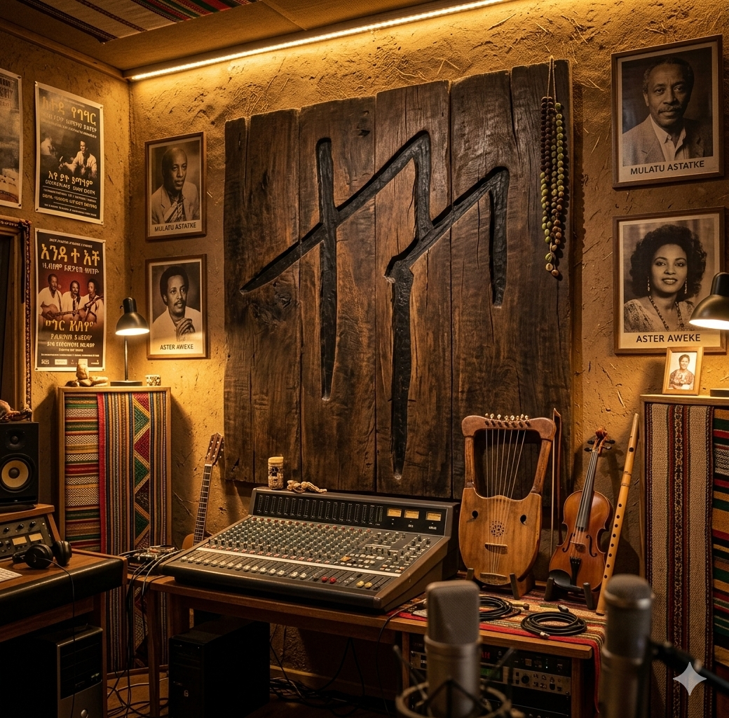
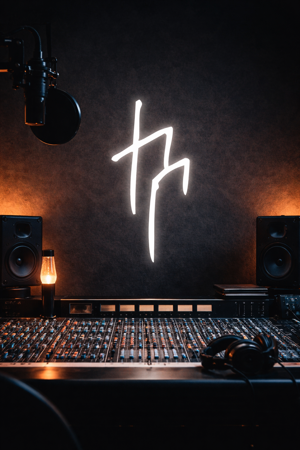
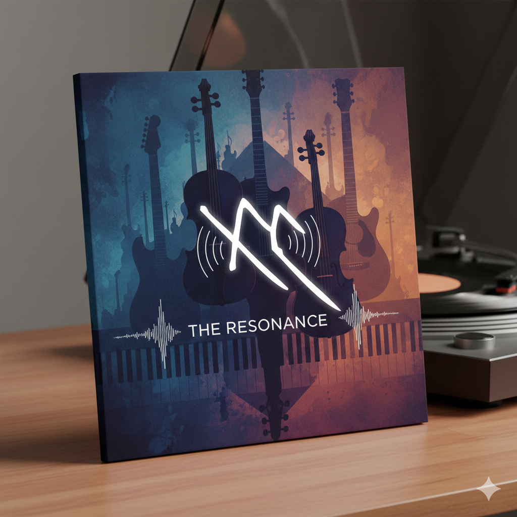
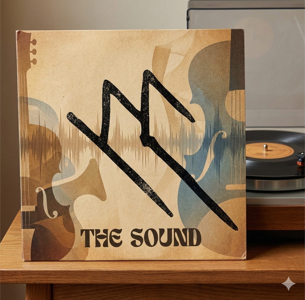
Logo Meaning
The logo has all the letters in "ተላሶን", and has M to express telason's Music love. The one line design and how one line is dependent on the other shows how people are dependent on each other, especially Ethiopians. The logo mark shows dependence on one another: All the regions in Ethiopia are dependently one, Ethiopian people are that dependent that the region is there for the naming only - because we are very mixed with one another. We are one. Telason is here to tell us that, also his logo tells that story. Also, it seems like a music note, but there's a less chance of you saying that - because the music note doesn't designed to make you feel that way. Telason himself is the new music note: the logo is designed to reflect that. We experimented with lots of logo designs, and also wanted to make it digitally, but the one I made using my iPad has to stick forever because of its elegant look.
Inspirations
From paintings and images of Minilik and Tewodros.
Typeface & Motifs
We are still experimenting on what typeface we should use, and also considering creating our own Telason font for it. But as of now, we are currently experimenting with three different types of fonts.
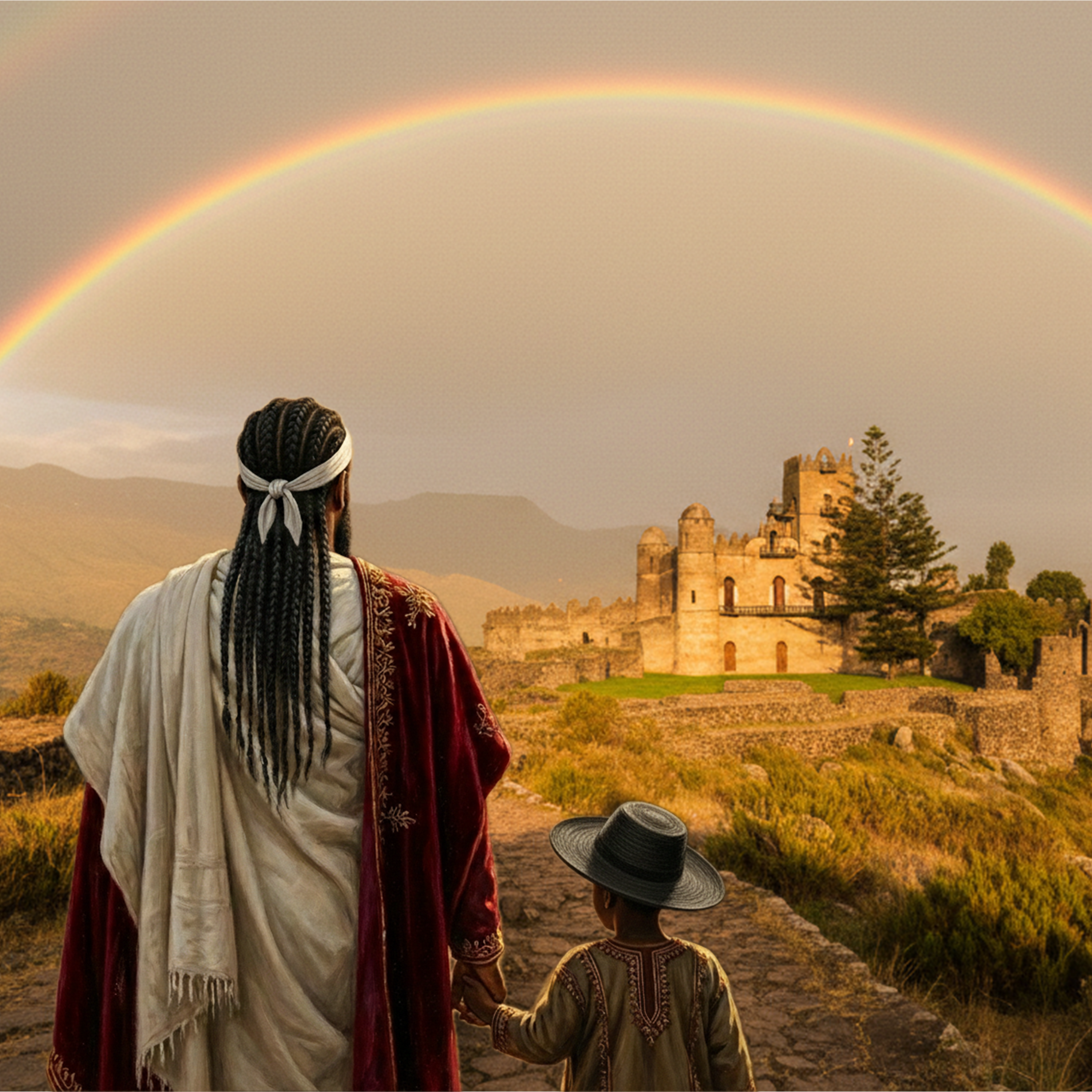
Song Cover Design
The cover is used to show the time where Tewodros took Minilik to his kingdom to teach him his kingship. It shows Tewodros holding Minilik towards the Fasilides castle. We used AI to achieve some certain looks but it took us 2 to 3 weeks to refine and re-edit to get our cover to work. It took so long I even started thinking I better illustrate it using my pencil. We really retouched it though. Although it had everything to do with the song, Telason is releasing a documentary for the music, and it has a lot of hidden things so I didn't want to spoil anything here. We experimented with a lot of cover designs also, but our hearts wanted this one.